The history of the logo
Symbols communicating ideas visually have been around for thousands of years. Humans have used emblems and signature marks to identify themselves for hundreds, even thousands of years. Many of the symbols of symbolic design throughout history have been used to convey identity visually.
Ancient Egyptians used heiroglyphs to show identity, Ancient Greek kings used their symbols on coins to demark reigns and the artisans would mark their pottery and art to identify manufacturers and for ownership. Ancient Roman bakers would stamp their breads for identification of their bakery and officials would use moulded stamps to endorse or sign documents.
By the twelfth century AD, logos showed up in two distinct forms: as heraldic crests and signages for shops and establishments. Heraldic crests were used to mark nobility and high ranking families and were often used as a coat of arms. Signages for shops and establishments came about due to the illiteracy of the general population. When you can’t use words to sell your wares, you must use pictures to depict the product or the location.
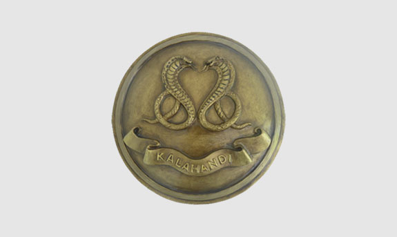
The crest of the Indian Princely State of Kalahandi. Image source: indianrajput.com
When textiles and paper production became more widespread, more and more authors, printers, and makers began using symbols to claim ownership of their work. With the advent of newspapers and industrialization, advertisements grew and early branding came about.
The effect of industrialization
The industrial revolution led to the rise in disposable income for a lot of people that led to the rise of retail. Businesses were established and an effort was put into branding and advertising in an early form. At the same time, mass production of printed materials became more common, making it easier for businesses to spread the word about their products.
As more and more businesses grew, corporations realised that a simple mark did not help distinguish themselves from the competition in an ever changing market. As a result, the logo was born.
Post world war 2
When companies realised how impactful logos can be, they moved away from logos that were purely utilitarian and started putting thought into branding their business. For customers to remember a business, a unique, simple, and clean logo was required.
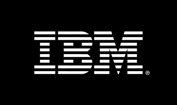
The IBM logo, designed by Paul Rand. Image Source: IBM
Logos further became an abstract and universal language that supported the company’s growth and indicated what type of business it was. The logo was to be both beautiful and functional, drawing great inspiration from the modernist movement. Logo design shifted to flowing lines, rainbow colours, exaggerated forms, and strong patterns and outlines.
The digital age
As the digital era grew, it became more common to have televisions and computers at home. As people grew more comfortable with digital technologies, 3D designs were not necessary in a 2D world, which led to the rise of flat design. While the more minimalist approach may seem like a step backward in the design movement, flat logo design helps achieve a cleaner, crisper, more modern feel; one that doesn’t take away from the substance of what’s being communicated.
The MTV logo was a revolutionary idea as it was adapted to tv and broke the so called rules of logo use and design. It was animated to be shattered, decorated, erased and reborn; evolving to fit the era.
The MTV logo questioned whether trademarks should be in static form. Channels like Nickelodeon and Cartoon Network followed suit and also featured animated logos.
Over the past ten years, logos have been simplified to adapt to the next great shift in the digital era – the smartphone. There is a great need for the logo to be clearly visible and effectively communicate at a quarter of an inch on a smaller screen.
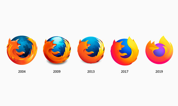
The Firefox logo has undergone many changes as the digital landscape has changed. Image source: turbologo.com
Why do businesses redesign their logo?
- Their audience has changed
- They have expanded or have a new focus
- The current logo looks outdated
- There’s new competition
Sometimes a logo refresh is enough.
A logo refresh works to tweak the design elements that are already there. A designer will add messaging, update colours, or simplify the look and feel of the current logo.
Are you bored of your current logo or looking for a new logo? Email us on info@gminfotech.in or get in touch with us via our website www.gminfotech.in and our designers can create your logo based on your brand identity!